Prague, Czech Republic
Housing
Completed
2016
Surroundings
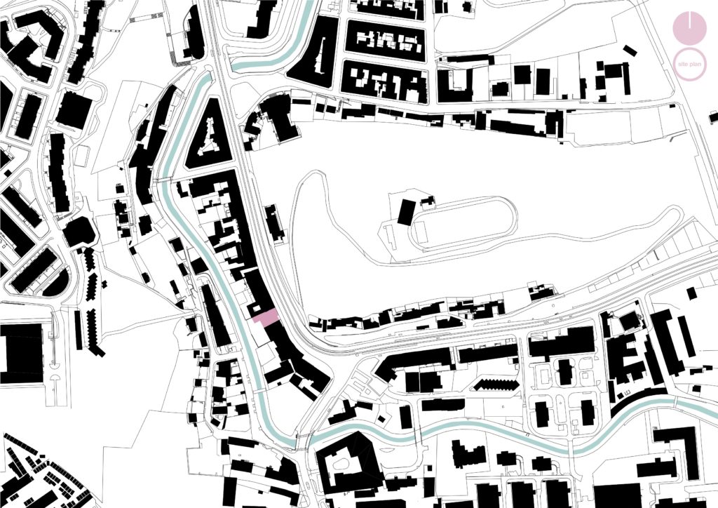
The Nuselska apartment building is situated in Prague 4 – Michle, where a torso of an early 20th century city blocks meets an older, organically grown development. The area has been targeted by developers during the recent years, mostly in a form of not particularly city-forming solitary residential buildings.
The urban structure has been defined by terrain morphology in the valley of the Botic creek between Pankrac and Tyrsuv vrch which prevented further expansion of a traditional city block development. The result of it is a disorganised, materially chaotic environment, where negative impressions are intensified by a peripheral character and a poor socio-economic status of the wider area. The Nuselska street, a significant composition and circulation axis, forms a backbone of the area.
Mass
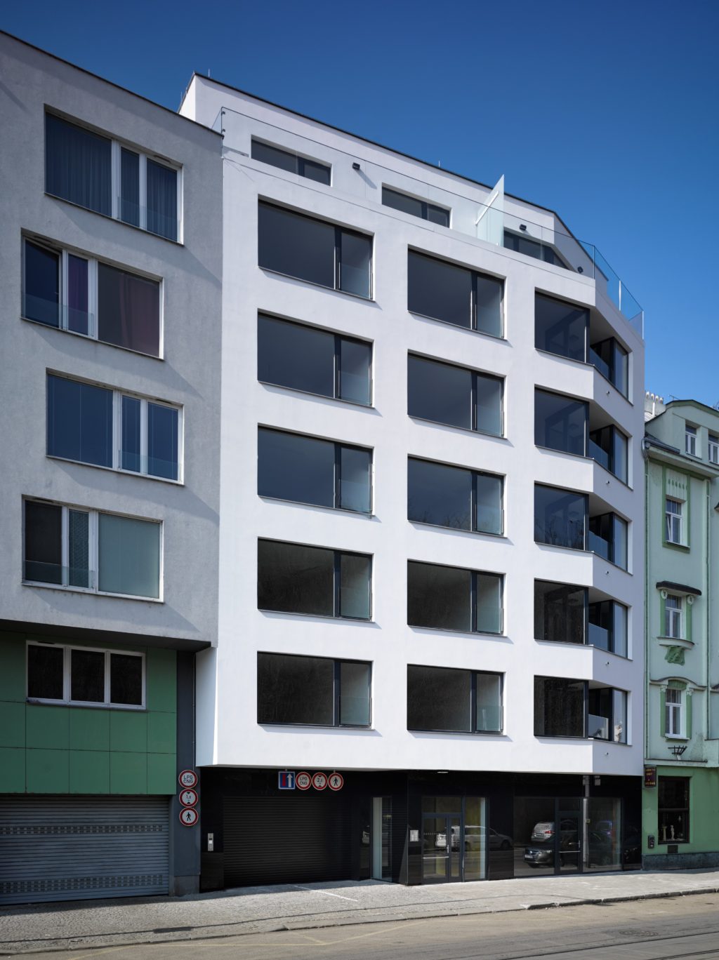
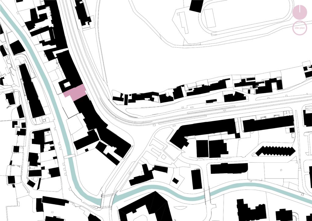
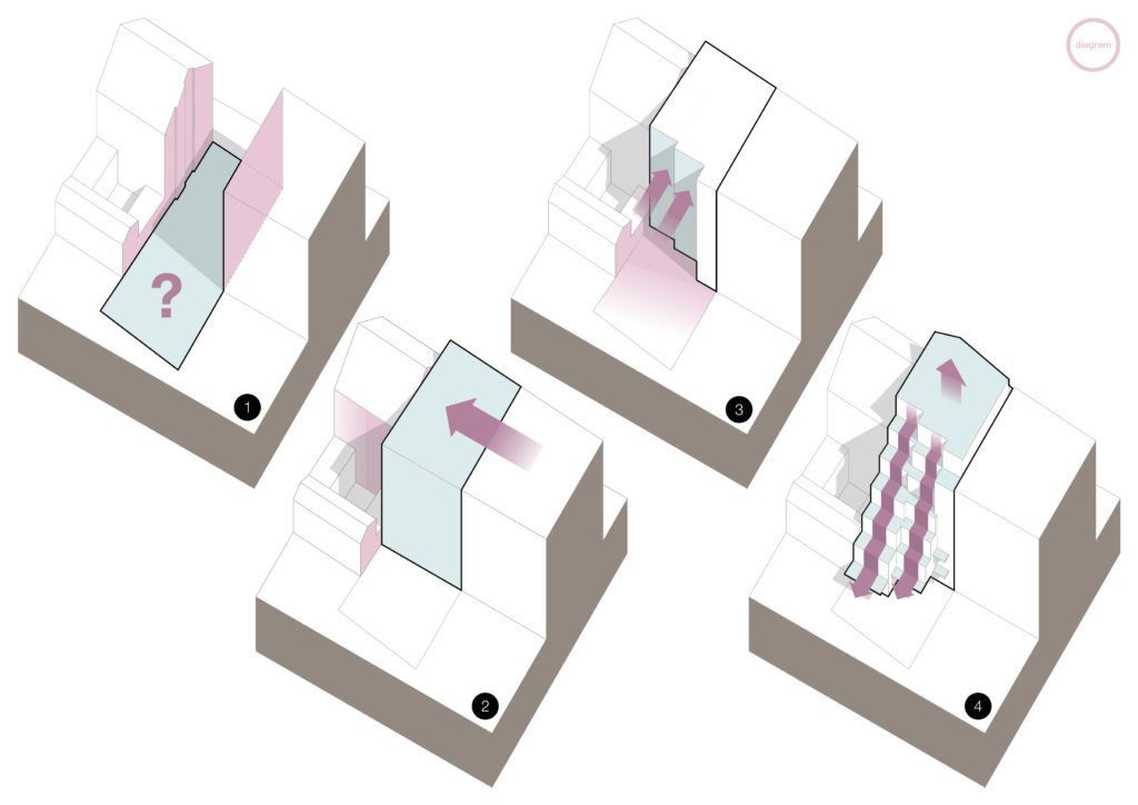
The newly built apartment building is situated in a vacant gap between the existing Nuselska street buildings. Its mass and shape were largely determined by a specific spatial configuration of the adjacent buildings, which differ by more than a hundred years in age and therefore are very disparate.
A recently constructed residential building on the south side is rather deep, whereas the Art Nouveau Hotel Michle building on the north side is shallow with additional two storey extensions in its courtyard. The adjacent buildings further differ in height as well as in the number of floors.
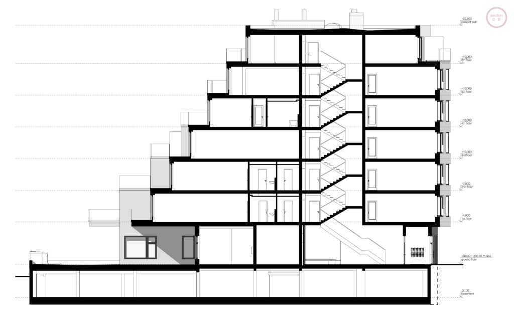
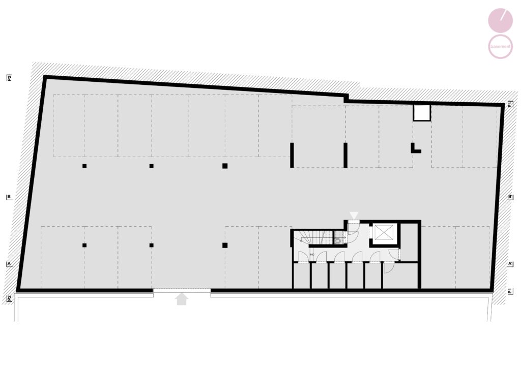
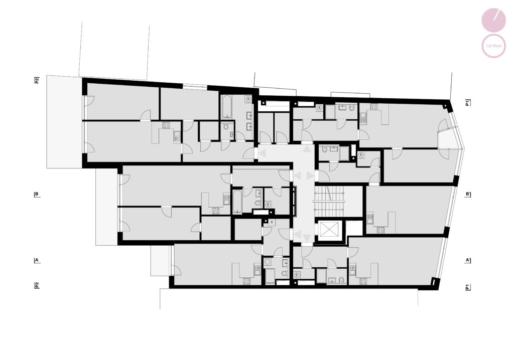
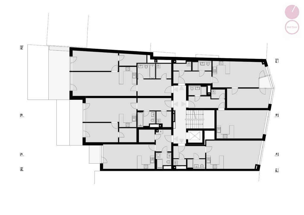
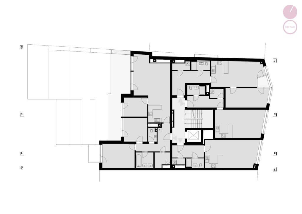
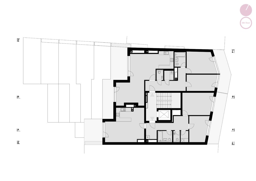
The new apartment building, designed with seven floors above ground and one underground floor, forms sort of a twin with its neighbouring building, which was developed by the same investor. They share their underground parking entrance and the passageway into the courtyard. With the exception of the street level commerce unit, the building consists solely of apartments. Small studios and one bedroom apartments face the street side, whereas the larger ones open up into the courtyard. The biggest three bedroom apartments are located on the top floors.
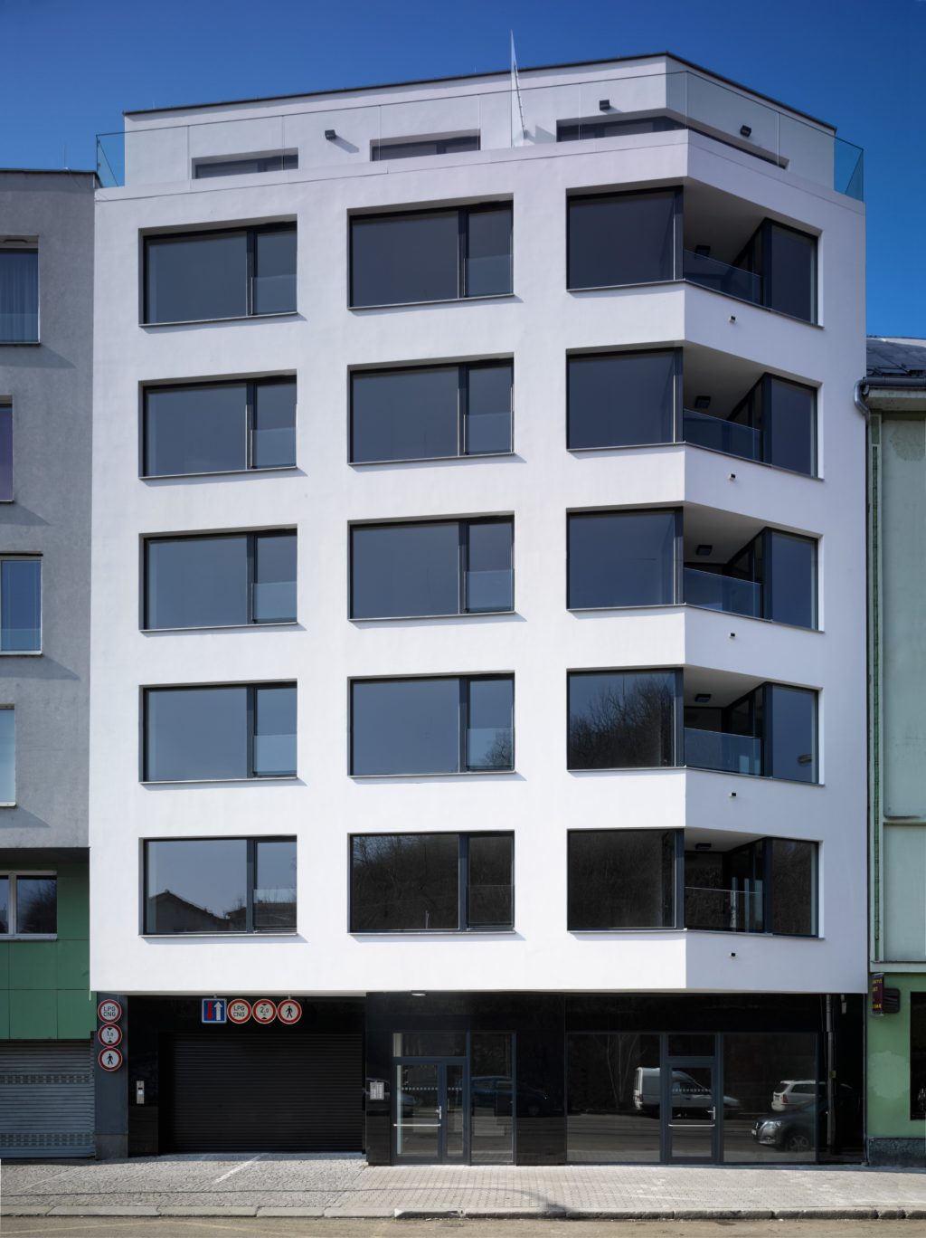
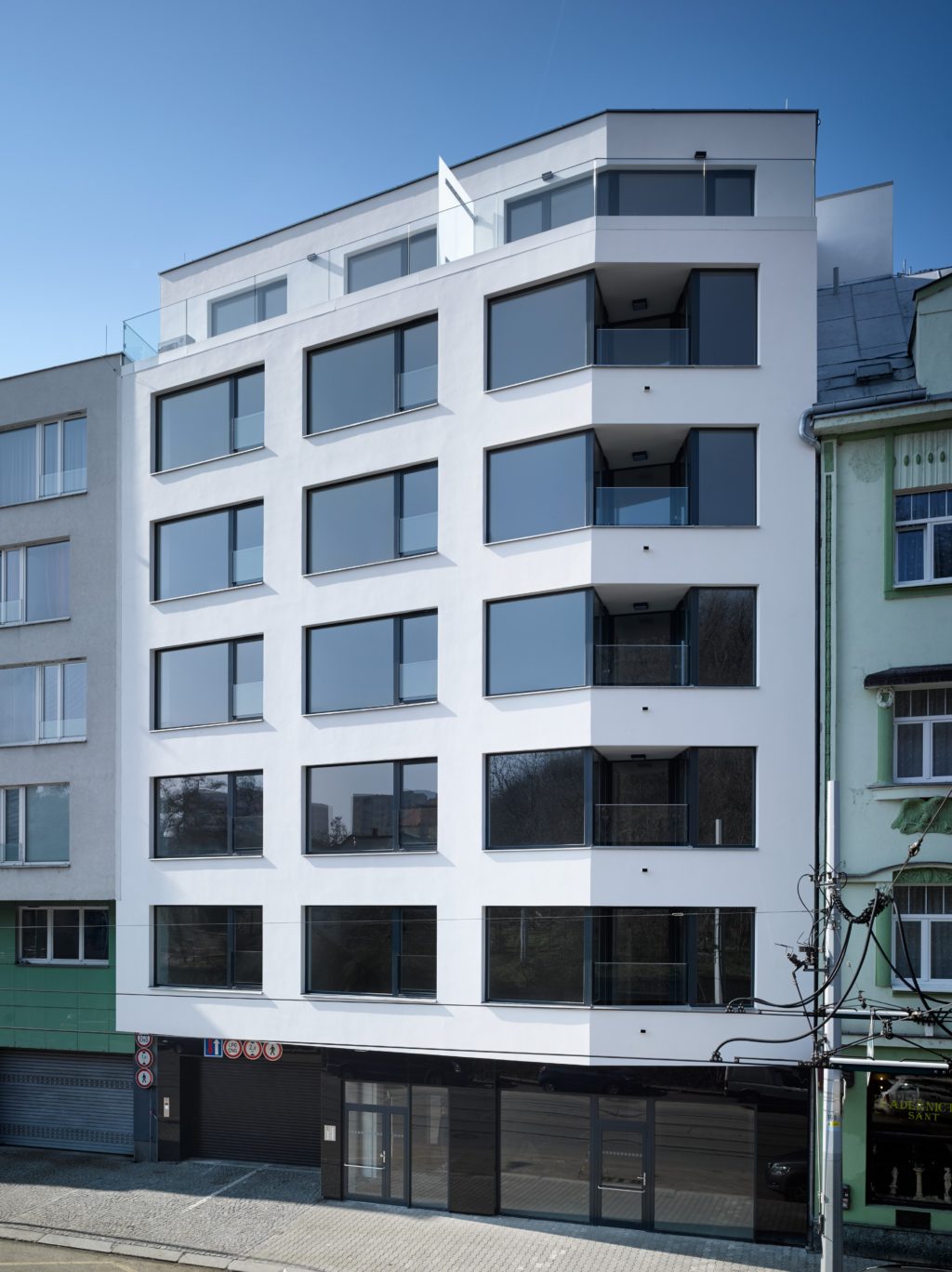
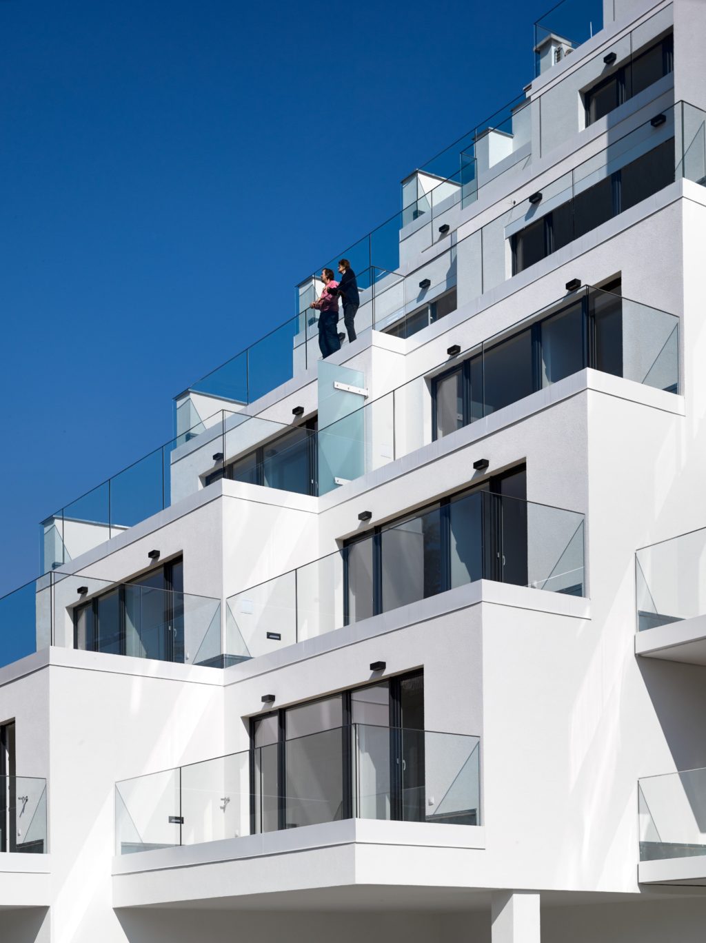
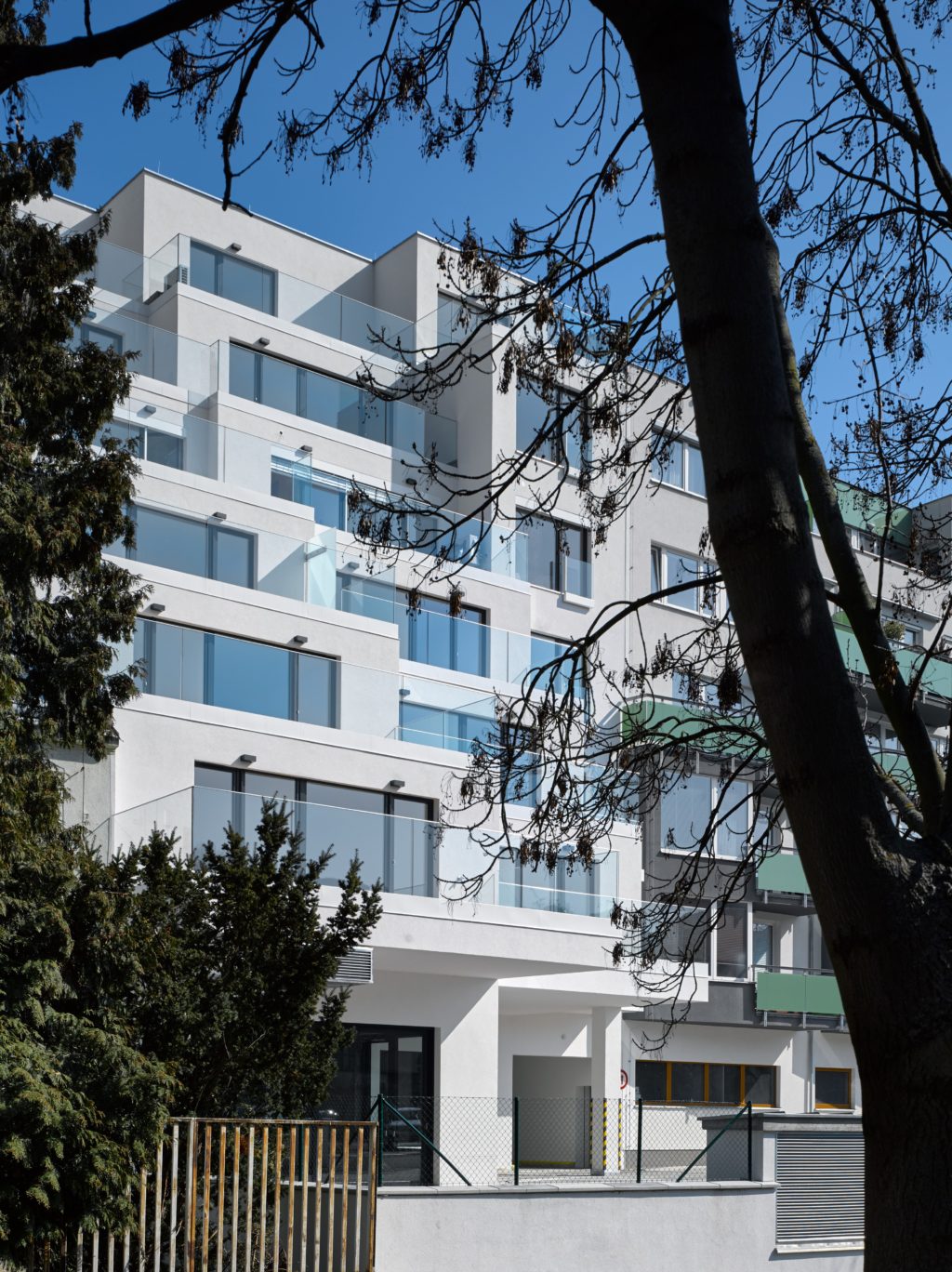
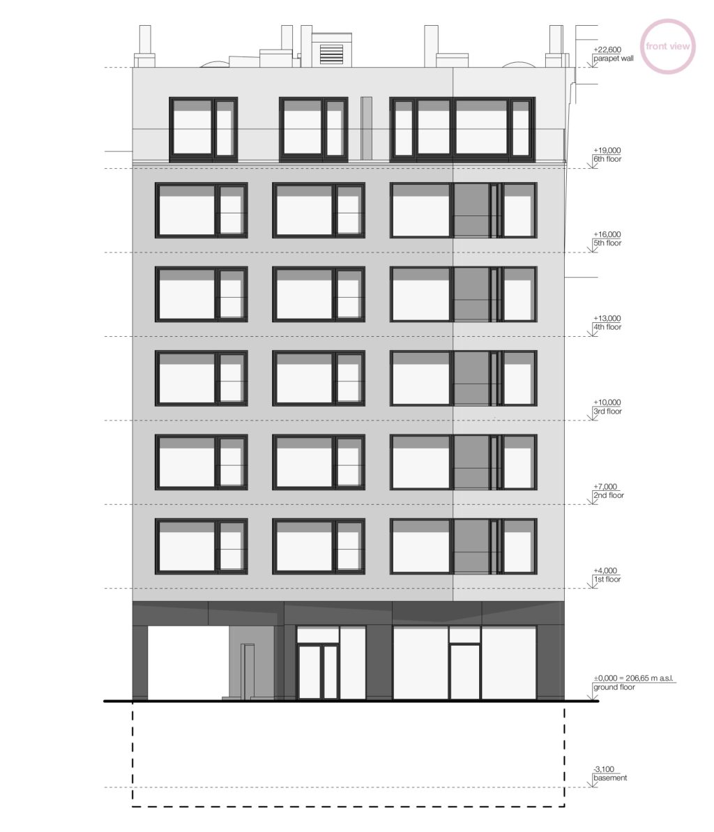
The street frontage connects seamlessly with the neighbouring buildings and fills the formerly incomplete street front. The street line of the ground floor is kinked in order to create a bay for cars waiting to enter the courtyard passageway. As the building is located in a place where Nuselska street turns around Tyrsuv vrch, the facade of the second to sixth storey is spatially bent out into the turn and cantilevered over the side walk, which enables interesting views in both directions of the boulevard. This effect is further enhanced by glazed loggias, designed in the break of the street facade.
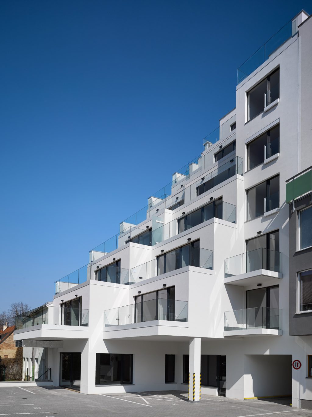
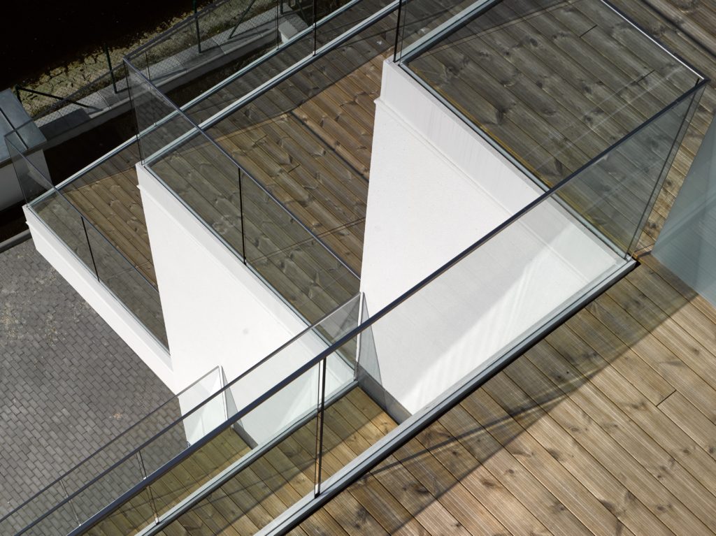
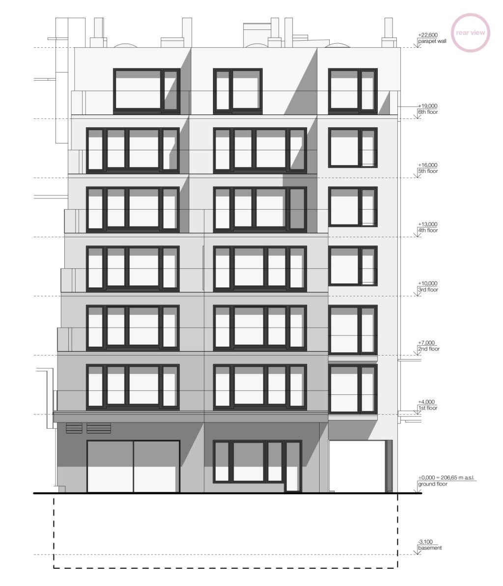
The courtyard facade, oriented towards the Botic creek is designed as terraced. While on the south side the object has the same depth of the tract as a connecting apartment building, on the north side the lower floors respond to the significant depth of development activities in the adjacent plot and, conversely, less depth in their own hotel on the upper floors.
Form
The form of the apartment building is simplistic and clean, deemed the only appropriate one within the context of the chaotic surroundings. The building is designed with a monolithic reinforced concrete load bearing structure with the exception of the top two floors, which are lined with ceramic blocks. The facades, solved as a contact thermal insulation system, are coated with a white plaster and divided by spacious black framed windows. More costly brushed facade was chosen for the street frontage. The railings on the windows, loggias, balconies and terraces are designed as frameless glass. The street parterre is cladded in large format sheets of black enamelled glass.
The exterior colours are reduced to black and white, with the exception of wooden floors on terraces, balconies and loggias, which are kept in natural colour. In contrast to the muted colours, the entrance spaces of the building are accentuated by a golden stucco on one of the side walls, which guides visitors from the entrance to the elevator and stairwell. The golden accent is clearly visible from the street through the display windows.
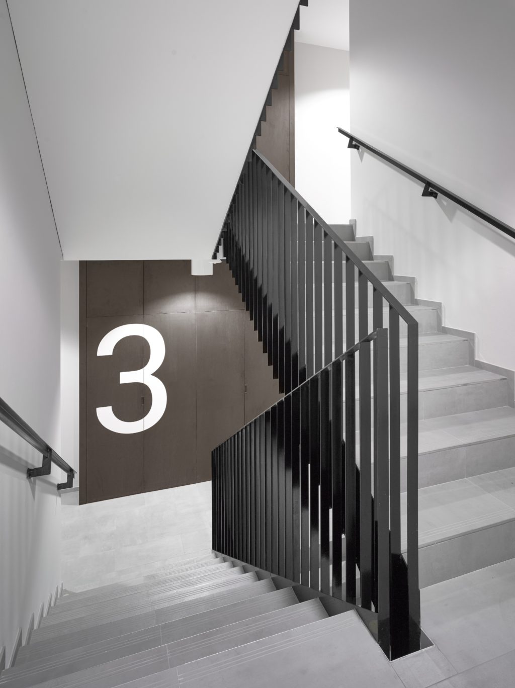
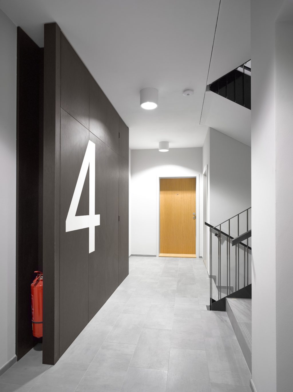
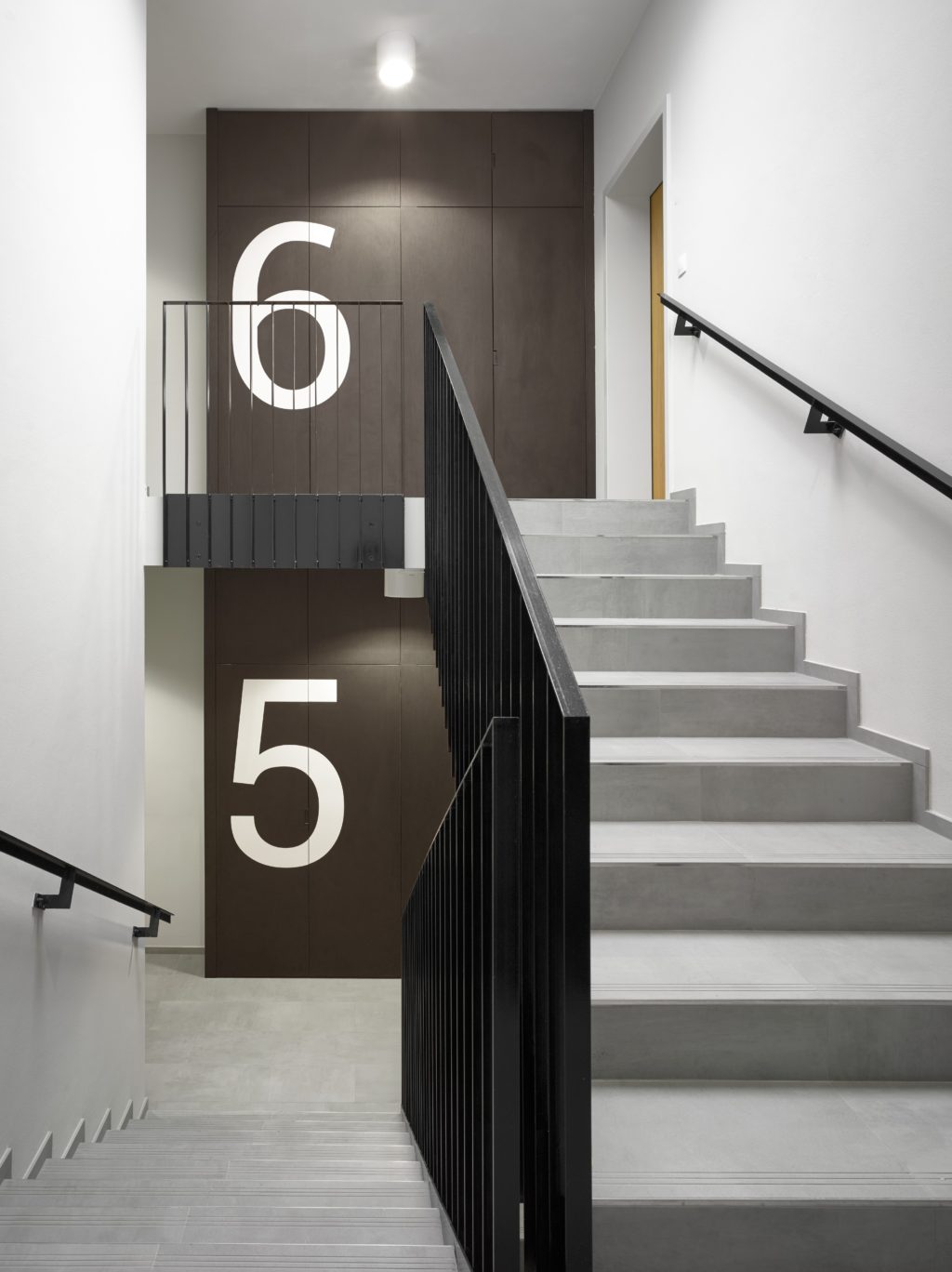
The colour scheme of the interiors is also subtle. The walls of communal spaces are light grey, just like the ceramic floor tiles of the stairwell or the steel door frames and doors of utility rooms. Steel railings and handrails of the staircases are black, just as the HPL foil upon the carpentry fowling of distributors on the main landings of the staircases, which simultaneously integrate graphic information indicating the floor number. Natural wooden finishes also appear in the interiors of the building: oak veneer on the entrance and interior doors of the apartments or oak flooring inside the apartments. Another distinctive feature of the entrance hall is a single-flight steel staircase with black terrazzo fliers and a glass railing.
